Adox Color Implosion… Back in 2016, I tested it a EI 50, 100, 200, and 400 and wrote up a lengthy, rambling report, which concluded with a decision to rate the film at 320 or so in the future. Of course I’d forgotten all about that when I loaded up a roll at the McKinney Photo Walk. I knew the film could be rated at different ISOs, but couldn’t really remember any of my tests—and didn’t visit my website to check, or even remember that I’d done the tests—so I trusted the 100 on the canister and shot the whole roll at one of my least favorite EI values…
Oh well.
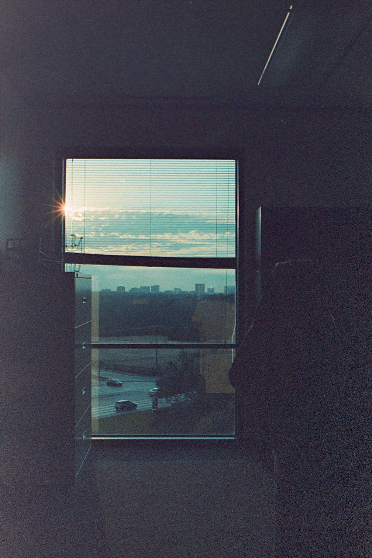
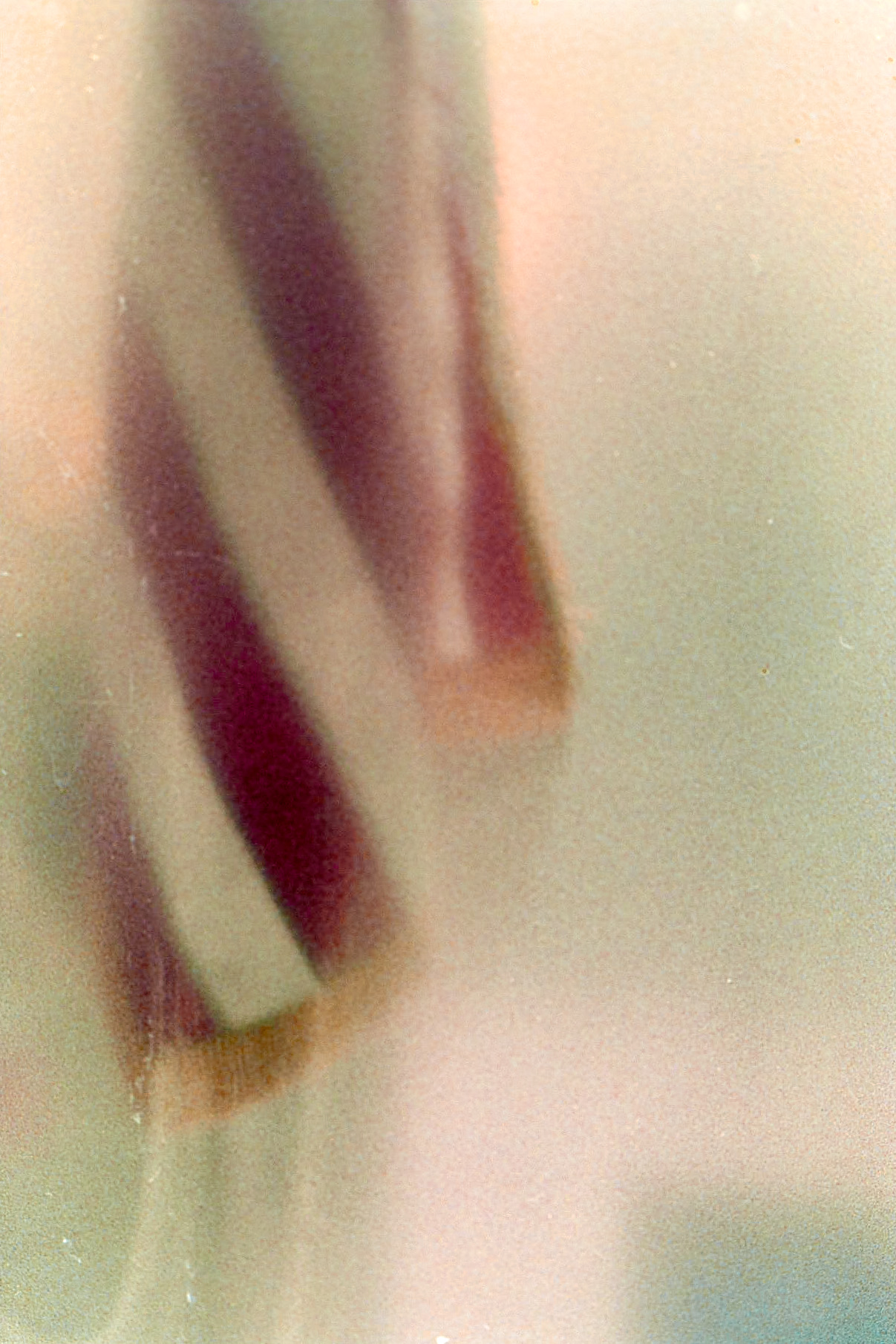
Check out that great 14 point sunstar! I love the 35mm f/2 D; what a great lens it is.
Anyway. I forgot that I pretty much gave this film a full review back in 2016. True, at that time, I hadn’t yet developed my reviewing scheme or star rating system, but still. I’m not sure I have much more to add.
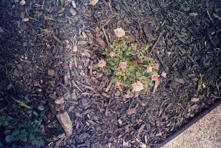
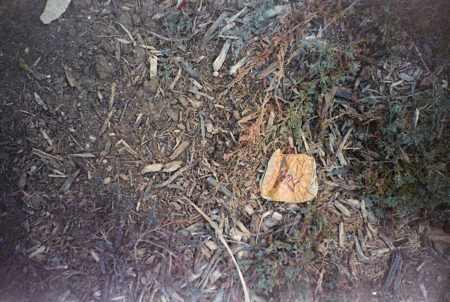
I went back and reprocessed some of the shots from that first roll in preparation for this post. With my new technique and updated vision, I got somewhat better results, I think. On the left, the mini-roses at EI 100, as processed in 2016. On the right, the crushed Squirt can, not shared back then, and probably also shot at EI 100, but processed with my current knowledge and technique (and color sense).
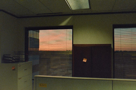
So if you’re unhappy with the slight redness at EI100, you can pull it out with a bit of levels play. And really, any color cast at any ISO is largely dependent on light sources. Sure, in sunlight, Adox Color Implosion goes a wee bit red. But at sunrise the light is different and it can go a bit blue (see above), and different sources of artificial light produce different colors, and reflected light from multiple sources gives a different cast.

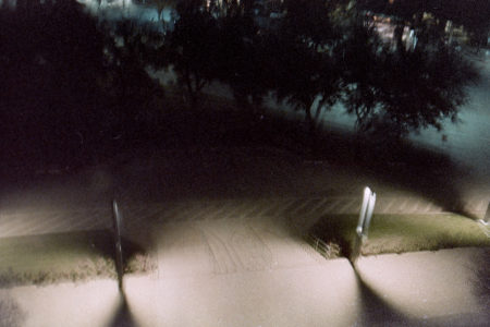
And if you add in some artificial toning or shoot in the shade or the dark, the Adox Color Implosion can really give some fun results.
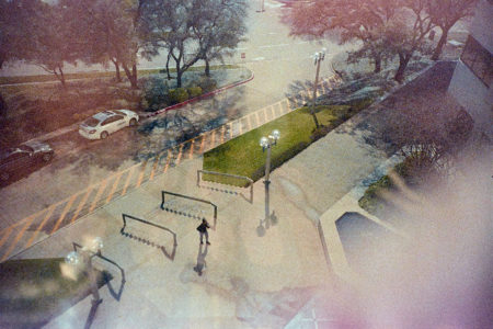

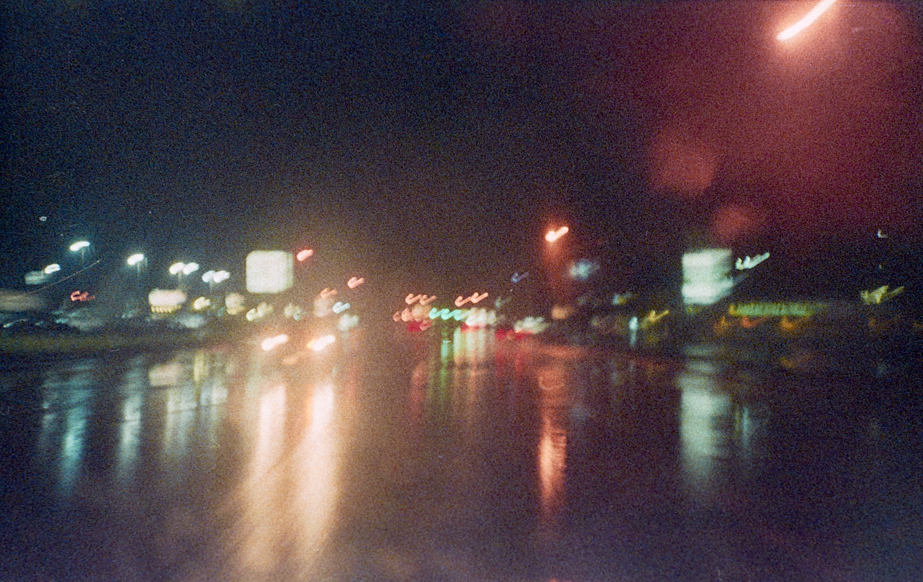
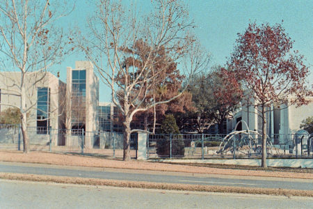
So. In general, lower EI values are slightly redder and higher values are somewhat bluer, but both are easily corrected/modified (in Capture One Pro 11, anyway), and all that goes out the window under artificial light and in the dark. Overall, whatever tones you get are slightly pastel or muted or something, and the grain, oh, my, the grain. Combined with the color, the effect is really pleasant, to my eye, and I rather like this film.
| Grain | |
| Character | |
| Handling | |
| Processing |
With it, I finally almost got the “patriotism” picture I’ve been working on for months.*
Overall, I’d give it 3.5 stars.
It’s a nice enough film, I think. Maybe my tastes have changed, but I have some appreciation for the grain, and the colors, and with some planning, I think I could make some really suggestive, evocative imagery with it. Sadly, it’s out of stock everywhere, and there’s no indication that Adox plans to produce it again.
Oh well. I think I have another roll in the fridge to play with again one day, and if I really do, hopefully, I’ll do something good with it, or at least remember to look back at my notes…