After 20 rolls, I decided it was time to mix up a new batch of C41 chemicals. I intended to order from the Film Photography Project, but they were out at the time. And Given the labor problems at B&H of late (and the fact that they no longer ship Tetenol, for some unknown reason… maybe they think it’s illegal to ship?, but really because if they insist on discriminating against Hispanics (or anyone, for any reason) they don’t need my money, or the money of anyone I can convince to buy from other than B&H),* I didn’t order from them.
So I had to hunt around a bit… Freestyle Photographic had some, and they’d ship, and I’m unaware of any labor disputes between its owners and employees, so I decided to order from them, and I got them to throw in a couple of rolls of film while they were at it, as my color negative film supply was running a bit low, and they had the Adox Color Implosion in stock too, and at a pretty good price, so I jumped on it.
So what is Adox Color Implosion film? Well, it’s a bit hard to describe.
The Adox people took an unnamed, very grainy film and treated it so the color coupler partially collapsed. Depending on the speed you shoot it at, the colors should shift. According to Freestyle, “When shot as a 100 ISO film it is rather muted with color leaning towards blue. When shot as a 400 ISO film it builds contrast and leans towards red.” And that’s pretty much what I found, though I did process everything I’m sharing below to an acceptable point in Capture One Pro, so ymmv with commercial processors, push/pull processing, etc.
I started the roll at ISO 100, but after shooting about 6 frames, decided to mix it up a bit and see what I got out of different ISOs. So I shot 8 or so frames at 100, then switched to 50 for 8, 200 for 8 more, and finished the roll at ISO400.
I developed the roll in fresh chemistry, as mentioned above (mixed in distilled water, for the first time: pro-tip, use distilled water… it’s just better), at recommended times and temperatures. Judging by the bromide drag, my agitation was off, but I think you can see the variation in the different ISOs.
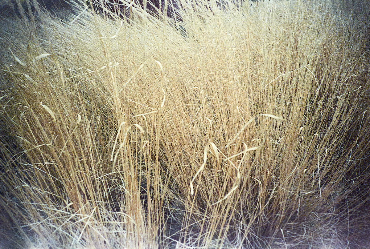
Adox @ ISO 50
To be honest, with many of these, I probably processed out most of the color shifts, so really what I’m looking for is differences in grain structure and ease of getting a shareable result…
The shots taken at 50 ISO were a bit harder to push around achieve an acceptable result, and it seems to me like the grain is clumpier or something, but it might be my imagination.
I like the wild color in this one, but, sadly, it’s due to the reflections of my hands and the lights in the office window, rather than the film…
Adox @ ISO 100
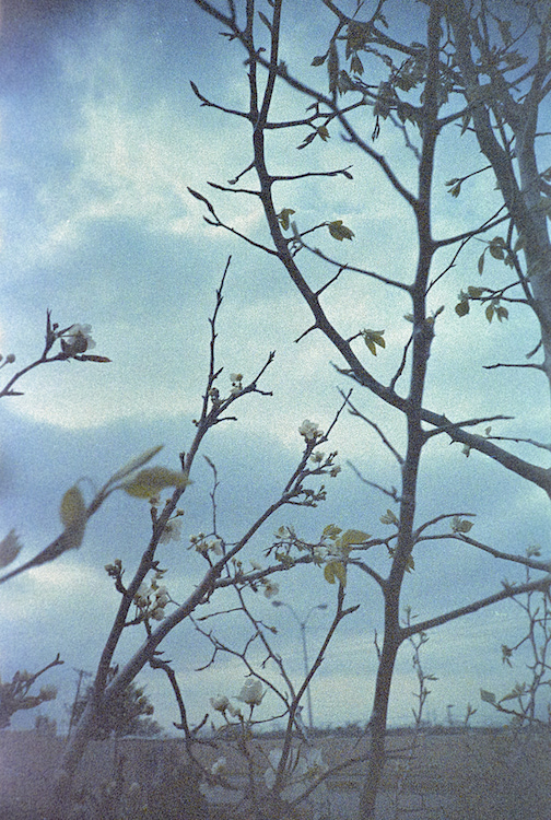
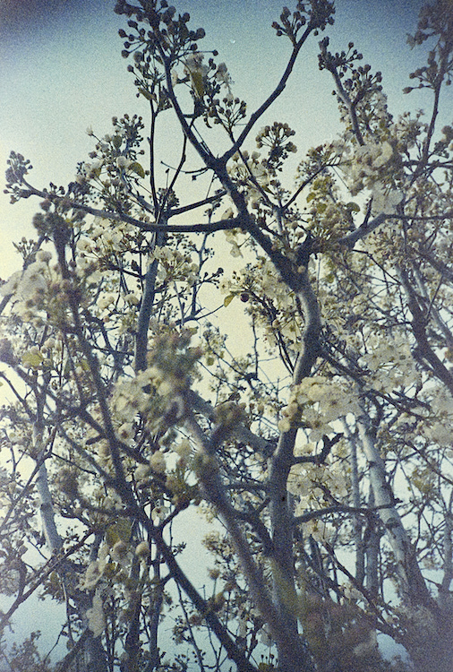
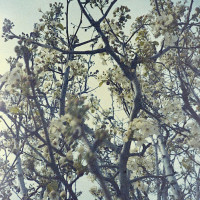
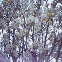
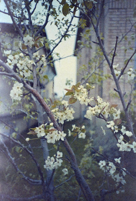
As mentioned, I started the roll at 100, so these shots came before the pictures at ISO 50. The Asian Pear tree did go a bit blue at ISO 100, and the grain is very noticeable, probably mostly due to the backlit subject and the amount of fiddling it took to get this far.
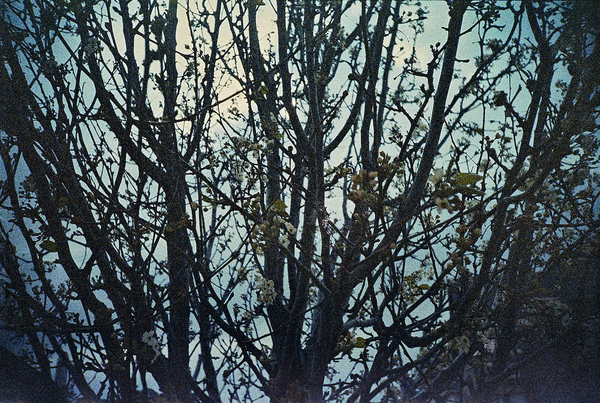
The result as essentially the same whatever flowering tree this is: grainy and rather blue… The Adox and the LC-A and my processing skills handled the strong backlight pretty well, I think, but that probably also contributed to the grain.
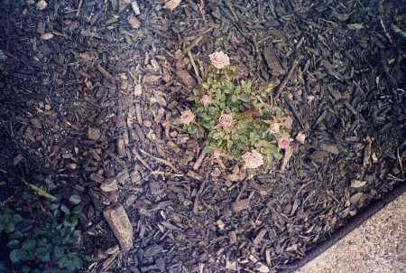
Interestingly, though, the mini roses went nice and pink. I’m not sure what the light-leak-looking line is in the left third of the frame. Maybe something from the treatment the film got from Adox?

But those mini roses, though. Nice.
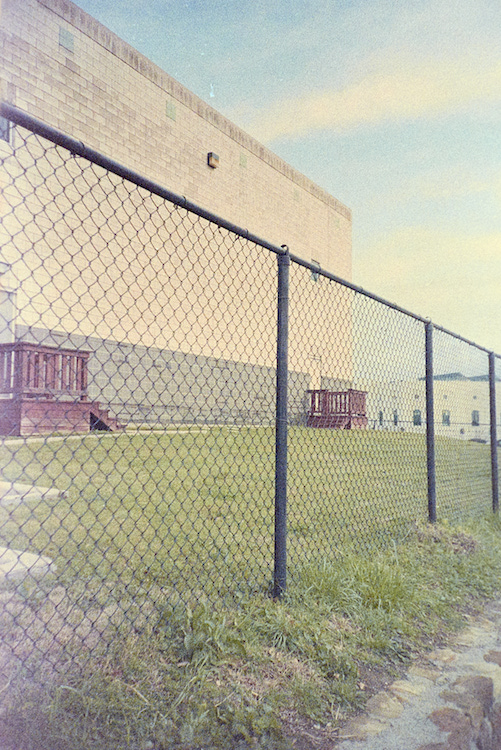
Adox @200
A couple of days later, after wrapping up the 8 shots at ISO 50 and while walking to the masjid for the Asr prayer, I switched to ISO 200.
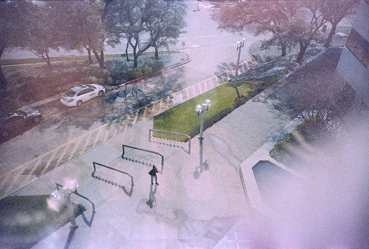
With good afternoon light, the color is much better, I think. And in this one, a shot of the back of the fire department gym/training center, the grain works with the picture and its content, and almost disappears.
On the way home, I shot the unknown tree again. Again, with the backlight and my processing, the grain rather pronounced.
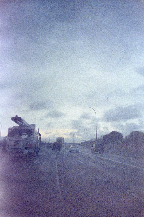
The next morning, I shot a bit on the way to work, but forgot to focus… I’m not a huge fan of the scale/zone focus system, as there’s no feedback in the viewfinder and I regularly forget that I need to focus. Sometimes a blurry picture works; sometimes not.
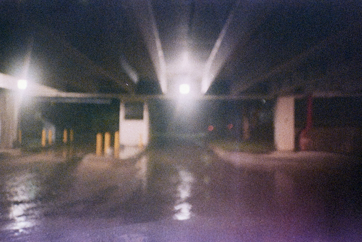
I’d like to make some claims about the grain being dependent on exposure, but I’m not sure that bears out. With the dark parking garage above, the grain is subdued more than the vignetted corners of the unknown tree, and the picture of the unknown tree probably got much more light than the one in the parking garage, but then the picture of the fire department training also got loads of light… maybe it’s evenness of exposure? But then this one of the wet drive home got insanely grainy, yet was rather evenly exposed, methinks.
Adox @400
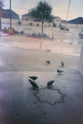
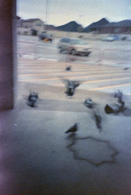
So the last quarter of the roll was all 400 all the time. After all the rain, the pigeons were all over the front of the masjid, scarfing down whatever they can find there, and with every opening of the door, they flew off briefly, and then returned as soon as the coast was clear, so how could I not snap a few pictures?
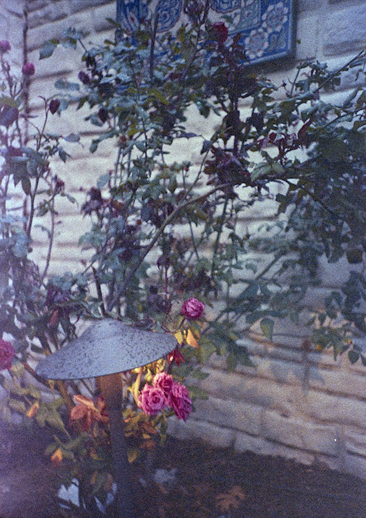
And then I finished the roll up on the walk home, first with a (I think) climbing rose of some sort on the pathway between the masjid and the neighborhood next door. The yellow of that light, and the blue of the late afternoon shadows work really well with the fuchsia roses, but I missed a bit on the framing.
And then, the usual suspects in the front yard… Let’s look at these with their siblings.
The Unknown Tree—I really wish I knew what it was—at 100, 200, and 400. I think you can clearly see the shift in colors…
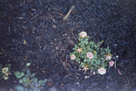
Now the mini roses, first at 100, then at 400.
And last, the Asian Pear, at 100 and 400.

In most cases, Adox Color Implosion is much bluer at 100, and slightly redder at 400, with near accurate color from 200-400. I have a couple of other rolls left, and plan to shoot at least one at about 320 if I can. I think that will give a result that I’ll be happiest with and that will be easiest to process, for me, with my current process anyway.
So Adox Color Implosion… it’s grainy, and the colors are off. It’s definitely not a film I’d use to shoot anything on assignment, but it’s good for some artistic interpretations, and I’m glad enough to have a couple of rolls in the fridge.
Have you shot with Color Implosion? Any thoughts to add?
*I didn’t publicize it much, but after the disastrous Supreme Court ruling in the Integrity Staffing Solutions, Inc. v. Busk case—which ruled that Integrity Staffing, a contractor that employs warehouse workers at Amazon.com warehouses doesn’t have to pay employees to stand in line and go through often lengthy security checkpoints after clocking out—and after a great deal of difficulty, I closed my account with Amazon and have not transacted any business with them since, except for two books that I bought from BookDepository.com before I learned that it had been purchased by Amazon.
If you can’t treat your employees fairly, if you can’t pay your employees properly, you don’t need my business.
I actually have a handful of photos from Mexico City where I used Adox Color in w/100 and 400 during daytime.
At first (because I had forgotten which film i put in during that day) i was a bit disappointed. But now that i’ve stepped back from the pictures I’ve realized how great they really turned out. Also the Pinks/Reds and oranges throughout the pictures are popping in great weird little ways.