It’s Polaroid Week again! Woo! I’ve been a bit slow so far, just 2 packs of Instax, 1 of new Polaroid Originals iType Color, and 1 (my last) of Impossible Project 600, but I have two packs loaded so more to come later… For now, lets compare/contrast the old Impossible Color, the new iType color, and Instax Mini.
Apologies in advance for my poor cropping. It’s more accurate than the viewfinder on the OneStep 2, but that’s not saying much… most of these are askew and show some bit of scanner lid. Shame on me, but I’m too lazy to re-crop just now.
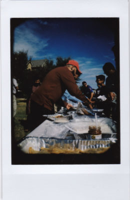
The week started out with a neighborhood pot luck. I didn’t shoot much Instax, and gave away one straight away, but it was still a good time.
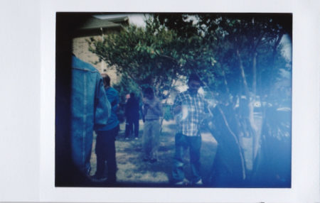
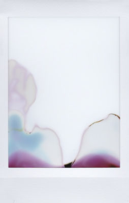
I’m not sure where the flare came from, but oh well. It may have gotten squashed or sweaty in my pocket: it was a bit warm out.
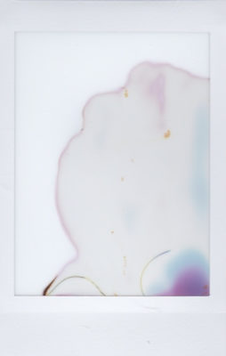
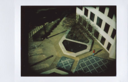
After the pot luck, I baked some cookies. I intended to document it fully, but only took one shot, and with that one, I had my right hand covering the slit where the photo comes out, and got some strange/interesting results from the brief obstruction.
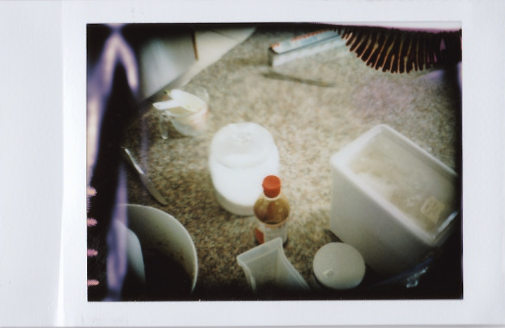
That looks kinda intreresting, actually, but it did something to the pack. It jammed, and I lost the last two frames, but I did get to play with the chemicals a bit…
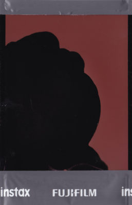
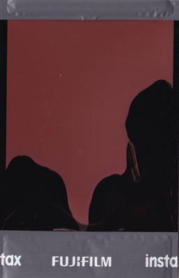
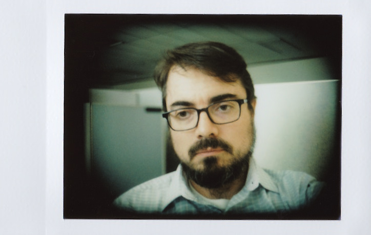
I loaded another pack and shot a great photo of my coworker Norramon “Meow” Saechew. The Polaroid Originals one isn’t bad, but the Instax one is great, I think.
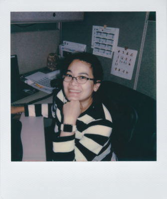
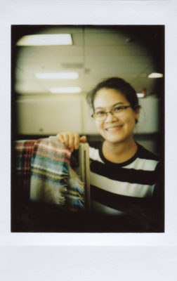
The Polaroid Originals iType shot looks like a Polaroid, for sure, but that Instax one looks like Meow and our office, the color is much more natural.
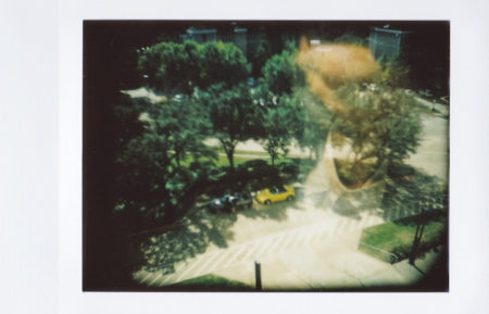
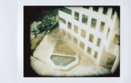
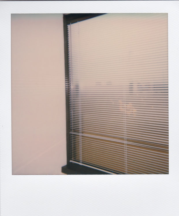
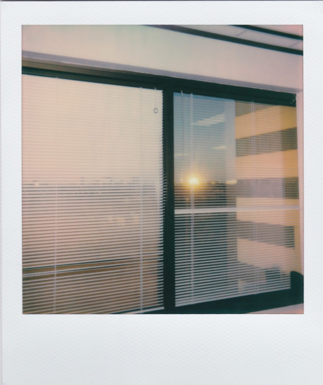
Speaking of office, I shot a bunch of Instax out the window to burn through a pack… I lost many shots to poor focus, as I also snapped a couple of selfies in there too. I like the out the window shot, but it generally works better in 35mm than on Instax, though the Instax does more clearly show reflections, especially when the focus is off.
And I got the best selfy of this round (until I shot one today in B/W iType… that later, God willing) from the Instax. I clean up pretty good sometimes…
I tried to compare/contrast the new iType with the previous version 600, but didn’t get too many a/b shots. These two are from the office. They were taken in the same corner, anyway, but I wish I’d stuck with a strict A/B, and tried a bit harder to frame the Impulse.
And they look pretty similar, really, both pink. but the older 600 stock is a bit more pink, maybe than the iType, but both have the Polaroid charm.
I wanted to finish up the packs and load up some Black & White, so I took the cameras outside and shot around a bit, and got a really good A/B shot of some roses out front. Impossible on the left; Polaroid on the right.
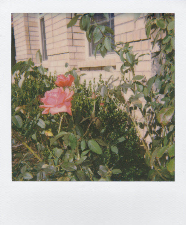
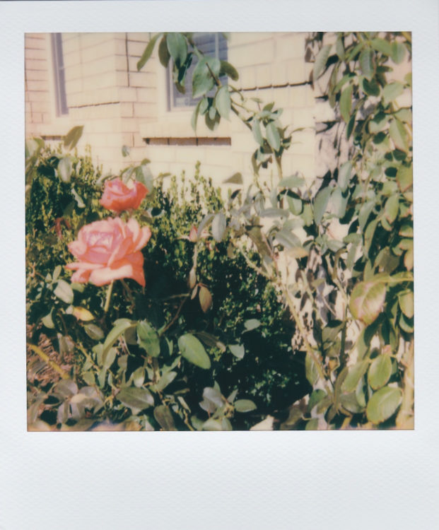
The new film from the new camera has much more contrast than the comparatively flat Impossible stock and the color is off, plus, the lens isn’t nearly as sharp. If I hadn’t seen these side by side, I probably wouldn’t have noticed. I knew the lens on the Impulse SE was sharp, but wow! The color is better, more natural, though I can definitely see a bit of blue tint from the flash, and the image might be a bit flat, especially next to the uber contrast from the OneStep 2 and new iType film.
I honestly wonder if its the lens or the film… I’ll have to get some new 600 film and test them side by side one day… maybe for the next #PolaroidWeek.
After the roses, I wandered over to the neighbor’s garage to photograph her late-blooming irises with the OneStep 2. I framed everything up fairly carefully in the viewfinder, making sure the verticals and horizontals were straight, then moved the camera up and to the left a bit to try and account for what I assumed would be parallax, but tried to keep the horizontals and verticals aligned. What I ended up with is nothing like what I tried to shoot. See what I mean by laughable?
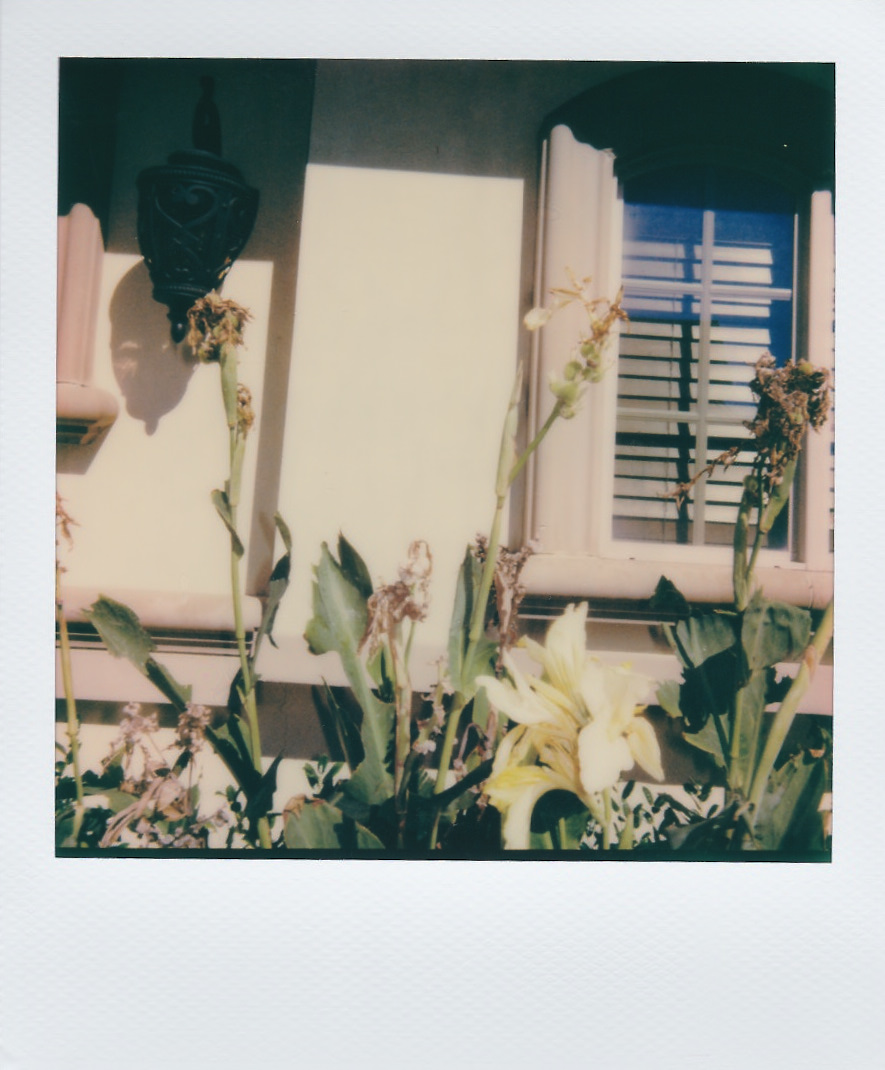
Maybe I moved the camera or something. Surely the viewfinder is at least square, but either way, it’s horrible. And what’s with that black bar at the bottom? I think it’s some kind of error with this frame, but I need to look more closely at the actual photo.
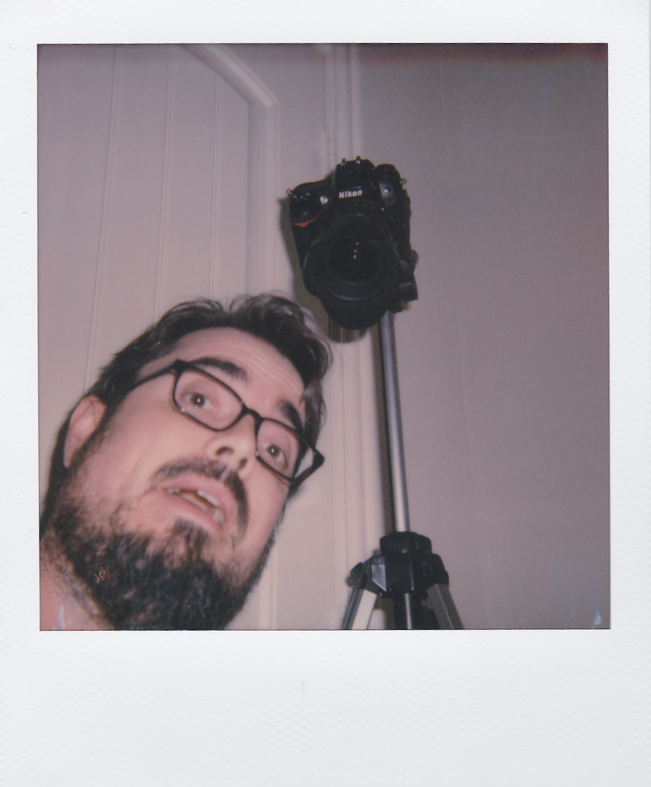
For my last two Impossible shots, I tested the viewfinder on the Impulse SE (more or less spot on) and took a selfy (but forgot to apply the closeup filter… oh well).

Now, I could’ve sworn that I had a pack of Impossible B/W, but I was mistaken. So I currently have one pack of Instax Monochrome loaded in the LC-Anstax, and one pack of iType Black & White loaded in the OneStep 2. I’ll try to shoot them today and tomorrow to get in under the Polaroid Week! wire, but God knows.
So I didn’t get any of the edge smearing that I noticed in previous packs of Impossible film, but then I also cleaned the rollers in the Impulse SE since then, so they may have been the culprit. It’s sort of a shame: I had some appreciation for the smearing and tearing.
Now, to be honest, I really wish Impossible had kept their name. I don’t like “Polaroid Originals” as much as “Impossible Project.” I guess they know what they’re doing, but “Polaroid Originals” just doesn’t have a good ring to it. Either way, God willing, they’ll keep producing film, keep improving their chemistry and product, and keep on keeping on for a long time to come. It’s great to have Instax around (and with the Lomo’Instant Square on the way), but it’s also great to have the Polaroid format back again, reasonably stable, and more widely available, more cheaply, than the Impossible stuff was, so lets get to shooting it!
Loved the review. Great subtle humor there too.