I’m not sure where I heard about Michael Ashkin’s were it not for. It wasn’t a Charcoal book, so I suspect it was the review and “Highly Recommended” rating from Jörg Colberg. I more or less trust Colberg’s reviews, and tend to more or less agree with him most of the time, but it was Ashkin’s use of text that pushed me over the edge.
The text in were it not for is sort of unique I think, in that it originated prior to the project. According to the Cornell University Architecture Art Planning department announcement of the book, Ashkin, who is an Associate Professor of Art at Cornell, began work on the piece in the late 00s and “wrote it [the text] entirely at night, in the dark, when lines would come to me during periods of insomnia, which is why the text contains bursts of condensed logic and shifts in register.” The text also lived as a performance piece, with Ashkin reading “it to public audiences multiple times, the first being at the Second World Congress of Free Artists organized by the Camel Collective in Aarhus, Denmark, in 2009.” The pictures were added later and selected from images taken during trips to California’s Mojave Desert.
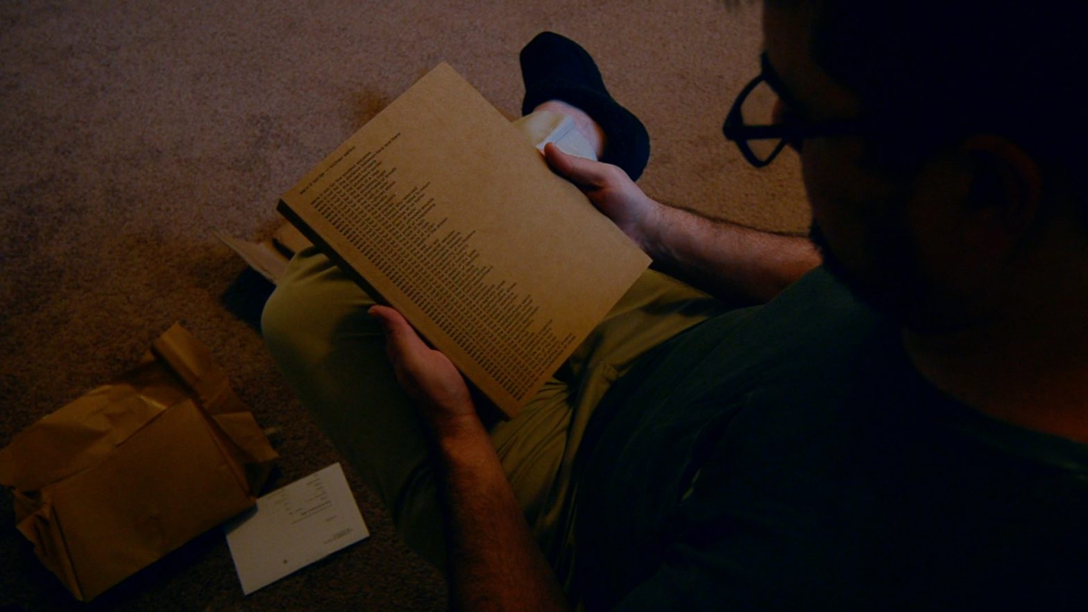
I’d like to deal with the text first, but to be honest, I haven’t been able to make my way through the cover text, let alone text on the inside of the cover, let alone the next two full front/back pages of text. My mind works in a strange way, and with every line of text beginning with “were it not for” I lose my place about 1/3 of the way and end up reading about three lines over and over, or end up skimming to the bottom, and I feel bad about just reading the last bit, whatever obstacle is.
When the pictures come in, I have the opposite problem: my eyes fly to the text, always at the bottom of the page, and I soon begin flipping page after page, “were it not for” this and “were it not for” that and never looking at the pictures. It’s a bit frustrating, if I’m honest, and I think Askin would agree that I’m getting the point. At points when I’m able to focus on the picture, I start trying to identify the backs of the few buildings: there’s a Pizza Hut and either a McDonald’s or (more likely) a Dennys in the first few pages. Otherwise, I try to find some way to imagine how the text fits with the picture, or if it’s supposed to or not, and before I know it, I’m looking only at the pictures and ignoring the text. “were it not for the complexity of the problem” gives way to “were it not the banality of the solution” and I just get on with it.
All this “were it not for”ing has me remembering the “for want of a nail” proverb thing, and I haven’t seen any other mention this. Maybe it’s too obvious. Of course, the proverb has a neat ending (the Kingdom is lost); Ashkin’s text just keeps going. And that’s part of his point, or aim, as well. As quoted in the Cornell announcement, Ashkin says, “Both the text and photos show what the ‘California Ideology’ has produced in our world. A situation where ‘anything is possible’ has produced its opposite. And it is not as if we have gotten to the bottom of this ideology…” And for any of this “were it not for” business to get tied up in a neat little bow like a good little proverb, we’d have to have a different ideology at work, we’d have to have gotten to the bottom and found a new hole to dig.
Anyway. The pictures are all desolation: failed desert housing developments; old, mostly unused and unpatronized fast food and casual restaurants and motels; abandoned construction sites; trash on the side of the road; boxy old apartments; broken-down trailer parks; boxy new apartments. Really, if Askin had turned maybe 15° in any direction, he might’ve made a picture of something interesting or pretty, even, but that wasn’t his aim. It isn’t ruin porn, or poverty porn, but it’s just what everything looks like here in the second (and now third) decades of the Twenty-First Century as wealth and power consolidates into smaller and smaller areas.
I mean, I could make these pictures here in North Texas. They’d have more trees, more grass, more new and ongoing construction, but it’s the same thing, or will be in 10 or 20 years. Colberg says it better than I could.
Wherever you look, whatever you hear, it’s all the same hopeless mess: a lived environment that more often than not looks like a garbage dump, with soulless anonymous architecture everywhere, and a cultural/societal environment filled with endless violence, dread, and despair.
…
I have been wondering when there would be a photobook about the Age of xxxxx. Here it is. As grim as it is, it is nothing but brilliant.
Colberg, Jörg. “Were it not for the nightmares.” retrieved from https://cphmag.com/nightmares/ 21 July 2021.
The one issue I have is that the text, which to my mind is the primary part of were it not for, was written in the Age of Obama, and the pictures made over a span of 44 and 45 (I’m guessing). That it came out during the last half of the former president’s term is maybe important, but it’s not like the “California Ideology” under 45 was any (or much) different than under Obama or Biden. Sure, there may be somewhat more bread for the rabble, but fucking billionaires are still taking cruises to fucking space instead of paying any fucking taxes and getting all of the news cycles for several days running even if the leftist news is all shaming them. In other words, the circuses haven’t much changed. I don’t mean to be so cynical, and please, Joe, whoever, someone, prove me wrong.
Anyway. It’s no wonder were it not for received Best of 2019 nods from PhotoEye (Adam Bell, Michael Mack), Deadbeatclub (Tim Carpenter, Matthew Genitempo, Raymond Meeks, Brad Feuerhelm) and Photobookstore Magazine (Brad Feuerhelm, Vanessa Winship), and Colberg loves it and points towards it and Alan Huck’s I walk toward the sun which is always going down as providing “a model forward for what can be done in/with photobooks.” I’m surprised it’s still available…
| Concept | |
| Content | |
| Design |
Overall, I rate it a strong 4 stars.
If you don’t have a copy already—and since it’s been out for two years already, if you don’t, why not?—FW Books still has copies available, and there are probably some on the used markets and elsewhere. And if you don’t trust me, there are loving, and better researched, better written reviews from Wayne Swanson at Photobook Journal, Loring Knoblauch at Collector Daily, and Eugénie Shinkle writing in 1000 Words (pdf available on Ashkin’s website). Speaking of Ashkin’s website, I sorta wish there was a bit more there, but then he’s an academic and it’s a proper Associate Professor of Art-type website: just the facts, and all. He’s made some interesting work, for sure, and some things I’d like to try (the photographs made with spray paint are something I’d like to figure out and try maybe) and there are plenty of facts, but not much in the way of text or anything, and his page for were it not for goes to a flip-through of the book on Vimeo. Oh well. Can’t have everything.
I don’t own the book, although I studied the preview pictures pretty carefully. Ashkin’s photos always strike me as very lazy — yes, I gather that he works and works and works, but the result still looks like something he banged out one afternoon.
Not that my kid could do it, neither one of them could. But once you get the hang of it, you can knock these things out by the gross, it seems to me.
Anyways, I was reminded to write an angry rant about the trend of photographing “non-places” so thank you!
And you did… http://photothunk.blogspot.com/2021/07/the-non-place.html
Good stuff, and I agree almost entirely as usual.