I came across Chris Neophytou‘s Tourista on Instagram one day. I’m not sure what account, maybe Out of Place Books, maybe somewhere else. I was intrigued by and interested in the format, and so ordered up a copy.
First thing I noticed about it was the high contrast and deep blacks brought on or emphasized by by the black paper stock. The super high contrast, bold saturation aesthetic sorta reminds me of Alex Webb, but only sorta.
For Tourista, Neophytu went on holiday in Italy, specifically Rome, Florence, Bologna, and Sienna. And the photographs are what you might expect from a zine called “tourist:” statuary, architecture, people milling about or standing or sitting around. What I find interesting, and what drew me to this zine, is the pairings and the novel-ish sort of binding.
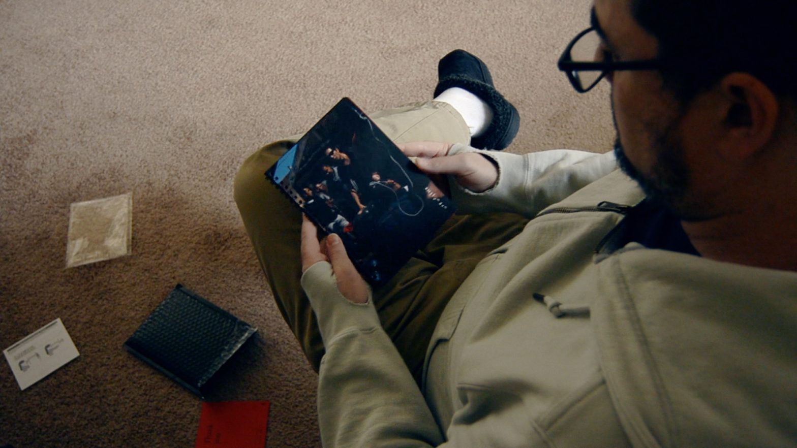
Taken singly, the pictures are standard streetog-on-holiday fare, but in pairing the pictures, Neophytou (and/or an editor) have turned each pairing into a joke, a scavenger hunt, most rather obvious, heavy-handed. The first spread features the back, left shoulder, and head of a statue, viewed form below, standing above (the photographs are printed landscape, and you flip vertically) a bunch of legs and feet on a marble floor. Turn the page and a slim young woman sits on a ledge, reading or chewing a nail, and right behind (below) her stands about 50 chairs. Turn again, and a statue high on a pedestal waves down at a weeping penitent (Mary?).
Of the six pictures just described, only the penitent statue is clearly legible. The others require bright light and tilting the book this way and that to try and make out the scene. I’m only slightly exaggerating. (A tip to Neophytou and/or the printer: should you reprint this, maybe print the book on white paper, and if you really need a black border on everything, print it. If you must print on black paper, choose a completely matte stock: the eggshell finish does you no favors.) This zine is extremely hard to view.
I choose to take this illegibility (and the heavy-handed pairings) as an intentional commentary on tourism in general, and I’ll leave you to consider what I might mean by that…
| Concept | |
| Content | |
| Design |
Given the issues with the printing, and despite the wonderfully cynical view of tourism presented here, I rate Tourista a not-recommended 2.6 stars.
You can find a copy direct from Cafe Royal. At time of writing, copies remained available, and the Cafe Royal previews of various spreads are waaay overexposed, punched up in post, or lit with about 10000 watts. I was unable to reproduce the rather flat look in any indoor lighting or under bright noonday sun. You can see the eggshell sheen, but trust me, in person, this zine is virtually un-viewable.
It’s really a shame. Neophytou knows his stuff. He holds a BA in Photography and lists a dozen or more projects on his website. Head over there and have a look. The Tourista photos there are clear and legible, though not paired as you’d find them in the zine. I’m sorta beyond my street photography worship phase, but his work is solid and worth taking a look at. And, after looking around, it appears that Chris Neophytou is Cafe Royal… or maybe Cafe Royal is Chris Neophytou. So if you like his work, Cafe Royal have published a handful of other zines with his stuff alongside works from a handful of other photographers, and presumably some of those are more legible.