Back in January 2019, Blake Andrews called attention to a sale on remaindered copies of Errata Editions’ Books on Books series at Powell’s. As of April, it’s still running, though options have shrunk quite a bit.
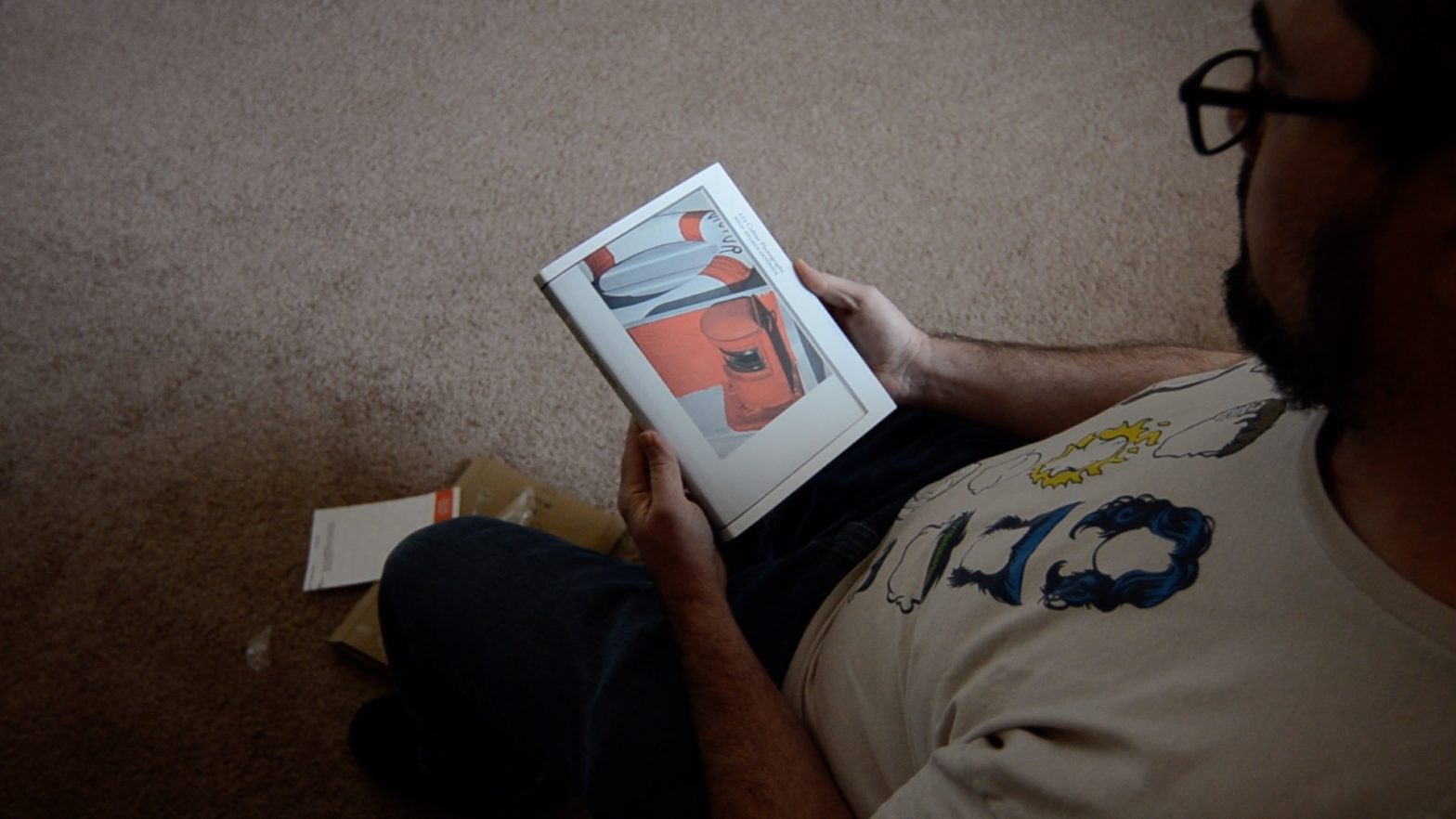
I don’t recall what all I picked up. I didn’t go crazy, for sure. But Keld Helmer-Petersen’s 122 Colour Photographs was one…
In his Intrduction, Helmer-Petersen writes that he sought to “…create pictures of somewhat greater aesthetic value….” “…by applying to color photography the universal rules of composition and blending….” “…to create a certain balance, harmony and rhythm, rather than to give any narrative content.”
The pictures aim at illustrating nothing whatever beyond the fact that we are surrounded by many beautiful and exciting things, and that there can be a great deal of pleasure in spotting them and capturing their beauty by means of colour photography.
Helmer-Petersen, Keld. 122 Colour Photographs. Errata Editions, New York, 2012. plate 3.
To this end, Helmer-Petersen used Agfacolor transparency film and a Leica IIIc, with 35, 50, and 90mm lenses.
Now. If all this sounds old hat, the advice and aim of countless photographers and photography instructors in the last, oh, 5 or 6 decades, consider that Helmer-Petersen published 122 Colour Photographs in 1948…
Most of the 122 photographs are details: close-ups of doorhandles; edges of buildings against one another or the sky; industrial machinery; parts of boats; baskets of fruit; hands. There are some more obvious landscape-type pictures, and a handful of portraits, but they’re all about color, composition, balance.
Some of the pictures recall modern art, paintings by Rothko, Motherwell, Kelly, but I wouldn’t put too much emphasis on that; Helmer-Petersen wasn’t trying to make paintings. He wanted to show that colour photography had value beyond the snapshot and the family vacation, that it was a serious medium for modern art.
It seems there were a handful of people, scattered all over the world, trying to do the same thing around the same time. I have Saul Leiter’s Early Color (acquired prior to this unboxing/review project), with pictures made in the late 1940s and early 1950s, and Fred Herzog’s Modern Color, with pictures from the 1950s and 60s. But Helmer-Petersen, there in Denmark where everything seems slightly ahead of the rest of the world, predates both, and prefigures the so-called fathers of color photography like Eggleston and Shore.
But the pictures aren’t really important or interesting because of the date of publication, or the technical means of production.
About halfway through, there’s a photograph of a young boy (I guess a relative of Helmer-Petersen, as he appears in another photograph later), standing on the edge of a lake, leaning wearily with his head and hands on a post. The bright sunlight creates a shimmer on the surface of the water in the top 2/3 of the frame, and creates a sort of halo around the boy, turning his blonde hair golden and bleaching his blue jumper white, and when I flipped the page and landed on it, I gasped.
The color is incredible, vibrant, but soft, and overall, it’s primarily a study of blue, green, and brown: blue of the water and the boy’s shirt, green of the grass on the shore, brown of the post and his hair and skin. Most of the other photographs are similarly concerned with one or two colors, and most were shot in brilliant light, but few have the glow and shimmer of this particular picture.
As with all Errata Editions Books on Books, it’s great to have Helmer-Petersen’s 122 Colour Photographs in my library. Original copies in decent condition go for $600 or more, well beyond my reach, and that I picked up this copy for $19 makes it a great, democratizing thing. I’ve discussed the drawbacks before: many of the two page spreads from the original photobook appear as two page spreads in the Books on Books series, but some come in 2 spreads to a page (so four pages from the original on two of the Errata Editions reprint). The William Kline one had 4 spreads to two pages. Additionally, each of the Books on Books are virtually identical in format, a squarish rectangle, pages smooth and low gloss, probably either smaller or larger than the original, and stripped of whatever tactility the original cover and paper stock had. I also wonder about the color fidelity of the scans. I’m sure they’re very close, but an old photobook on slightly textured paper just feels different than a modern reprint.
Anyway. As a (mostly) color (hack) photographer, I appreciate the early champions of color photography. Helmer-Petersen is among the earliest and his pictures from the 1940s still hold much of their charm and interest, even, what, 80 years since the book first appeared.
Unrated.
122 Colour Photographs is out of stock at Powells, but available elsewhere, both in this Errata Editions version, and in the incredibly expensive and hard to find original, so go find a copy!
Edit: in an earlier version of this post I incorrectly suggested that Helmer-Peterson was Dutch… apologies. He was Danish. Huge thanks to Thomas for the correction!
Hi James
Great post! Thanks for sharing.
Small but important correction — Keld Helmer-Petersen is Danish from Denmark (not Dutch from the Netherlands). He studied and taught with Harry Callahan for a few years and also met Aaron Siskind among many others, so then like today no doubt they inspired each other.
Thank you, Thomas! And… corrected.