I can’t figure this out on my own, so I’m asking for your help.
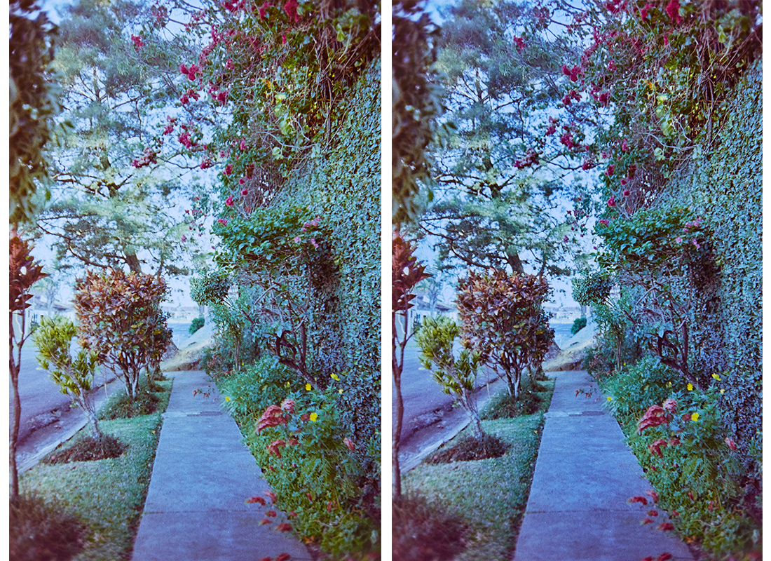
On the left is the picture as processed on the (calibrated) Dell 2408 WFP. On the right is the picture as processed on the (calibrated) MacBook Pro (mid-2012, non-Retina).
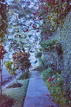
Which looks right to you, and why? And if both look wrong, why?Here they are in full size if you want a closer look:

The one on the left looks good on the Dell, but too red on the MacBook Pro; the one on the right looks good on the MacBook Pro but too blue on the Dell.
Both monitors have been calibrated via the DispCal GUI for Argyll CMS, using the i1 Display Pro calibrator.
If you have any tips on getting both monitors closer to correct, please share. I tend to process a bunch of pictures on the sofa at night while my darling, adorable wife studies next to me, and I don’t want to have to come back and re-adjust the white balance on everything unnecessarily. I also don’t want to push out a bunch of overly blue pictures.
Thanks in advance for your comments and advice.