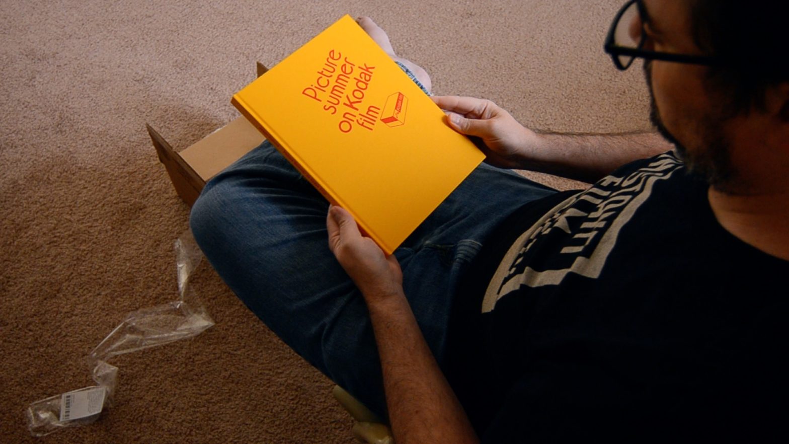
Jason Fulford‘s Picture Summer on Kodak Film came out more than a year ago now, right as the pandemic was really getting going. I didn’t plan on picking up a copy, as I was in debt reduction mode when it was announced, and to be honest I was surprised when it arrived. I’m not mad or anything: I have another book of his, and while my review of that one isn’t my best, and while I’m not entirely sure I get his work, I’ve come around to Picture Summer.
Edit: as a couple of commenters pointed out, it seems Fulford did indeed shoot film for Picture Summer on Kodak Film. I don’t know where I got the idea that it was digital. The images themselves suggest it, look too sharp or too… something to be film to me, but then I never like really sharp photographs anyway, probably due to my generally poor eyesight, and the images in Picture Summer… are nice and crisp.
Anyway. I stand corrected. Fulford did indeed shoot film for Picture Summer… as far as I can tell, and according to 2 different commenters. (Thanks for reading and reaching out, by the way!) What follows is my original review, and I more or less stand by most everything I said in it. The me of late January 2023, when I wrote this edit, gets Fulford’s work and project more than the me of 18 months ago did, and, still, “desert” strikes a different image for me than what I see outside the window every day. Just the other night, though, my darling wife referred to North Texas as a desert, so I guess it’s a matter of perspective.
Anyway, end of Edit, on with the original review.
First off, if you read the title as I did, you might be surprised to find that Fulford shot digital for the book. It doesn’t matter, of course, but Picture Summer on Kodak Film sorta suggests, well, film, in ways that digital photographs just don’t. Given that I pretty much only use a digital camera to film unboxings (and scan negatives), partly because I just don’t like the way digital photographs look or, rather, because film just looks better, well, perhaps you caught a whiff of the disgust I fell when flipping through the book the first time. Really, though, it doesn’t matter. And, really, the title plays more as a suggestion of feeling and works with other text in (and on) the book to drive Fulford’s project home, and has little to do with the making of it.
Many reviewers mention the fictional aspect of Picture Summer, and it’s there, of course, though it plays a bit differently, or is set in a different place for me than to some other reviewers. According to a Hilary Moss, writing in the New York Times T Magazine, the book portrays “…an imagined desert town….” A blurb next to one of the pictures in The Guardian gallery, for example, reads “…different locations come together in the book to create a fictional place, an imagined desert town with its own internal logic.” Now I don’t know what deserts the authors are thinking of when, but the “town” in Picture Summer looks sorta like North Texas used to, like South and West Texas still do, and not like the deserts in New Mexico or Arizona or Nevada or, say, Egypt. It is a dry place, sure, and I suspect it’s meant to recall the dry-looking places in Georgio di Chirico’s paintings…
Why do I say that? Well, Fulford ends his brief Acknowledgements with “And thanks to Georgio Di Chirico for your early paintings from Ferarra.”* And not only that, Fulford included a statement from an early di Chirico self portrait, “Et quid amabo nisi quod ænigma est?”** on the back of the book, in a font that’s eerily similar to (probably Adobe Illustrator-ed from) the Di Chirico painting itself.
I don’t know where this “desert” business comes from. Perhaps Fulford said so in an interview I’ve not looked hard enough to find. And maybe Fulford meant to show a desert, though I’m sure he knows enough to know that none of the pictures really show desert. Sure, there are deserts in some of the places Fulford photographed for Picture Summer—the photographs were made in California, Canada, Mexico, Thailand, Vietnam, Nepal, Japan and Italy—but, for example, Death Valley is not pictured. The Chihuahan and Sonoran Deserts are not pictured. Maybe some of the places abut a desert, maybe some fo the interiors were shot in, or near, deserts, and the places are drier than New York or London, for sure, but there’s too much green—even dusky, dusty, beige-green—to be desert proper, at least in my limited imagination.
Anyway.
The photographs repeat and remix from the very first page, from the endpapers, in fact. There are spectra, what other reviewers call “test strips,” mostly monochrome images that feature striations from dark to light (and back again), printed on the end papers, made by bricks and shadows and a guy holding a rainbow of lighters and by various painted walls out in the world. There are repetitions produced by a triangular prism filter and by reflections and whatnot. All in all, there’s a real This Equals That*** to a good bit of Picture Summer. There’s even the near-obligatory picture of a (probably closed) camera store.
Interspersed into all the spectra are other sorts of pictures that play with shadows and distances, signs and symbols in really surrealist sorts of ways. Every now and then bits of text—a poem from Gillian Frise and Heather Frise—interrupt the flow and make me chuckle some, and the whole book works like a sort of homage to Di Chirico. I quite like it.
| Concept | |
| Content | |
| Design |
I was always a fan of Di Chirico, even if I pronounce his name wrong; while I don’t much like the digital aesthetic, I get the appeal, I guess, and it doesn’t matter anyway; and Fulford knows his way around books. From the 1970s Kodak-Yellow and -Red, to the repetition of forms and mixing of paper stocks, it all just works. Over all, I rate it a strong 4.3 stars, even if I’m still not quite convinced by the Gossage/Cole/Fulford photographs-of-nothing school, even if I still don’t really get it.
Picture Summer on Kodak Film sold well, but Mack have copies available (at time of writing) for shipment in the USA only, and you can probably find used copies around. I’m glad to have a signed copy, even if I don’t remember quite why I bought it… To be honest, for awhile there I bought nearly everything Mack put out and was easily swayed by their “last copies” and “last chance” marketing. And while that habit soon proved untenably expensive, it means I have shelves full of really great photobooks, many of which I simply don’t quite get. And that’s my fault, not Fulford’s… or Cole’s… or Gossage’s.
*Fulford, Jason. Picture Summer on Kodak Film. Mack, UK. unpaginated
**What shall I love if not the enigma?
***I should probably pick up a copy of This Equals That one day… might help me see better. Maybe I’d get Fulford, Cole, Gossage, et. al. a bit more.
“I just don’t like the way digital photographs look or, rather, because film just looks better, well, perhaps you caught a whiff of the disgust I felt when flipping through the book the first time.” How can you feel disgusted at which camera a person uses… also, this was all shot on film.
Where did you read that Fulford shot this book on a digital camera?
I’m not entirely sure. It may have been an interview on the Nearest Truth podcast (now seemingly defunct) and perhaps I misunderstood. Everything I find now suggests Fulford remains a film adherent.
I’ll hunt around some more and update as necessary.
Thanks for pushing me!