Matt Martin is a photographer, curator, and promoter of photocopied photography… Photocopied photography? Yep. Check out @thephotocopyclub, which Martin founded, and his series “American Xerography 2016-2018.” In monochrome, the quality reminds me of punk flyers and zines, and has some relationship to Provoke and William Klein. In color, though, it’s something else.
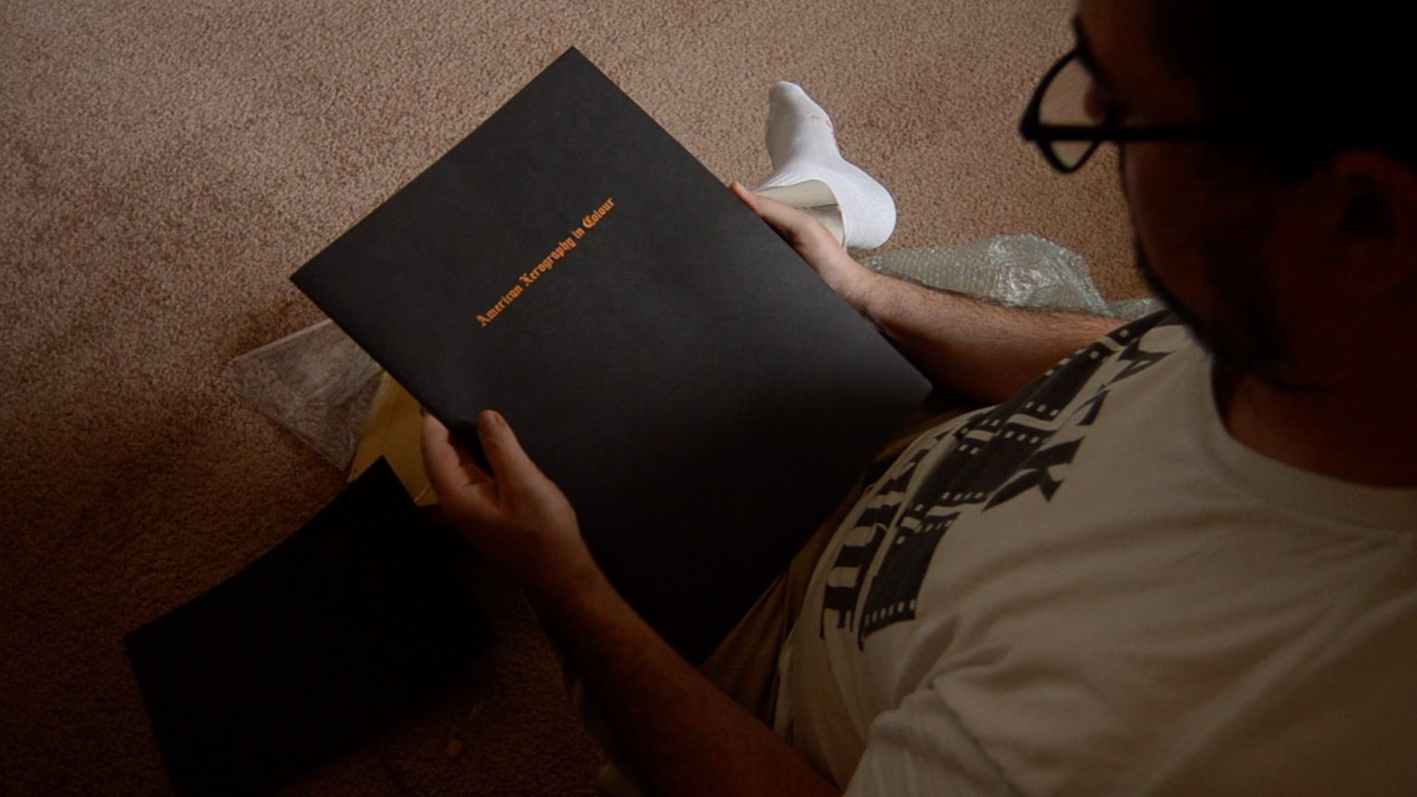
American Xerography in Color started out as a limited edition, stab bound book in 2018, and transformed into this half-newspaper-sized zine in 2020. The feel of the paper (Martin says it’s a recycled stock, 100gsm Revive Natural) and way the ink lays on it reminds me of the local paper, sorta, and has me checking my fingers for ink stains, but the zine seems stable.
For a London-based UK Citizen, Martin spends a ton of time in the US and it seems that most of his work was made here. According to a Facebook post from photobookstore.uk, Martin made the work in this zine over a two month road trip across 30 States, and while his earlier work focused on LA and the west coast, this current series concerns “what Americans would leave behind if they were to no longer exist on the land.”
Undoubtably, we (us of European descent, broadly speaking) have made a huge impact, far more than the original inhabitants. I’m not sure that Martin’s work really shows this. Roads and bridges and dams might stick around for awhile, but most of the houses and other structures Martin depicts are in the midst of falling down, with caved-in roofs and signs that nature is reclaiming the place. And all the cars he shows have flat tires, are partly or largely overgrown by weeds and small trees.
In an interview on the Delphian Gallery podcast, Martin talks about picturing the American landscape, in general, and seems to be referring to the Shore/Sternfeld era, rather than the Evans or Halpern schools. The photographs have that sort of heroic vision feel, probably owing something to the print size, and remind me of Sternfeld some. Martin also mentions looking at old issues of National Geographic and trying to replicate the color and feel, the dot printing, dye transfer process, and, as far as color goes, he got there. The images are mostly two shades too warm, veering towards orange, and rather overly contrasty. The process shifts colors slightly, and it seems Martin has or takes some control over the outcome, sort of playing the copy machine like a fiddle or something.
With the monochrome series, this is obvious: the artifacts of repeated photocopying are clear, and the images look like old punk flyers and zines. With American Xerography in Color, though, it’s not so obvious in most of the images. Most of the reds are blown, as are the highlights, and some images show a grid pattern or something like digital artifacts in areas of continuous color. Overall, I can see the photocopy origins of the prints only because I know they originated as photocopies… In other words, the process isn’t necessarily betrayed in the product.
Other photographers used this technique. If I understand correctly, this is how Ninagawa Mika developed her signature color: her photocopier was broken in such way that produced wildly saturated primary colors. And if you look at her work, there’s none of the artifacting that shows up in Miller’s, and I only mention this to illustrate that the technique isn’t quite as necessarily glitchy as perhaps Miller intends it to appear.
I like the way he treated his images. The color is a bit hot for my taste, but I like the grain and (faux) dye transfer look, and it’s something worth exploring in my own… I wonder what inkjet printing a 4×6 on my Canon multifunction thing then scanning the print would look like. Hummm… could be worth a try!
| Concept | |
| Content | |
| Design |
Strangely, disturbingly, it seems that American Xerography in Color remains available. For such a nicely printed, if overly large and precious, zine with a limited run of 250 copies can remain available a year after production… I mean… sure, my horrible little zine of 25 copies took me several years to give away, but it was tiny and horrible, and I’m a nobody. Martin has some credibility: he ran galleries, founded collectives, appeared on a podcast, and runs the photobookcafe. The zine itself was partially funded by Carhartt WIP, the sort of haute couture line from the well-known workwear manufacturer. How is it he still has copies available?
Do your part and go pick one up.
For more on Martin and his Xerography, visit his website or Instagram. There’s some good stuff to be seen.