
American Surfaces probably needs no introduction. Produced during a road trip from NYC to Amarillo, TX in 1972 (with a jaunt to the England and the US Virgin Islands) and exhibited at the LIGHT Gallery in October 1972, it’s part of the photography canon now. It took what Robert Frank (and Walker Evans before him) started—the elevation and celebration of the everyday—to new heights and didn’t receive publication until the late 1990s, and then only in a wildly abbreviated form.
The first Phaidon edition (2005/2008) expanded the original 174 photographs to 320, and this new Phaidon edition includes an additional 40, previously unpublished photos, with entirely new scans, crops, and color-correction, so while it’s a sort of reprint, it’s also something more.
I picked up a copy of the 2005 edition, the first Phaidon hardbacked one that was reprinted in softcover in 2008, back in 2012 or so, and its one of my favorites. So when I saw there was a new edition coming, I hesitated a bit. Do I really need another copy of American Surfaces?
Well, the addition of 40 new pictures, plus the opportunity to order a signed copy for pretty cheap, pushed me to it, and so here we are. This (compulsion?) also gives me a chance to compare/contrast some.
In general, the biggest difference is in the color. The 2005 edition is warmer, sorta like Kodak stock, and the new edition is cooler, more like Fuji. Teju Cole notes in his Introduction, “Palette of the Age,” the negatives were rescanned and color corrected, so I guess that makes sense, though I wonder if the 2005 edition wasn’t color corrected? Given that the project was shot on Kodacolor, I suspect the 2005 colors are closer to what the photolab printed out in 1972/3, but who knows. I could go to the Metropolitan Museum of Art and maybe get a peek at the portfolio made up by Weston Naef, with the original 174 prints plus a few extras, but given the COVID-19 outbreak and my current finances, that’s out of the question. What I can do, though, is visit metmuseum.org and compare their online scan to the two versions I have here…
Take, for example the photograph the Met refers to as “Amarillo, Texas, July 1972.” The same photographs, sorta, appears on the bottom of page 100 in the 2005 edition and at the top of page 108 in the new edition. Sheesh. The Met version is orange, like a print from 1972 would be, even with excellent archival storage since the mid 1970s. The 2005 print looks completely natural, or, rather, it looks like a photograph made in 1972, if it was more recently printed at a local photolab, a bit orange, perhaps, but completely natural. The 2020 print, by contrast, looks like a modern, color corrected scan, almost clinical in its analysis.
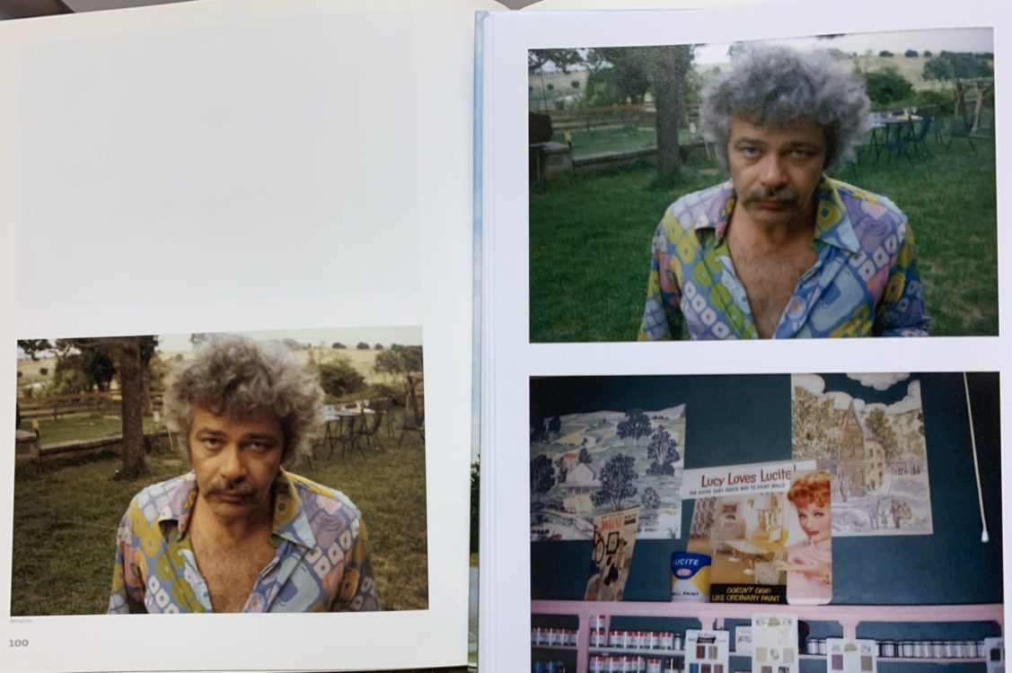
Looking at the edges of my 2005 copy, it seems to have yellowed somewhat on the top and side, and a bit less on the bottom edges, so maybe the prints have also aged somewhat. But I doubt it’s that. I think the whole project was reimagined, redone, remade, rather than reproduced, according to Shore’s (and Phaidon’s, perhaps) tastes today, and there’s something off-putting to me about that.
I’ll let Teju Cole provide the retort:
The materiality of those early high-gloss prints exhibited at the LIGHT Gallery cannot be experienced in this book. Professionally rescanned and color corrected, the pictures have less of the rough-and-ready vibe of Shore’s original drugstore prints. This is as it should be. American Surfaces is first and foremost about contemporaneity. In its earliest iteration, that meant using a widely available and cheap form of presentation. But what was artless in 1972 can, with time, become serious, precious, or self-regarding. Fortunately, Shore has no commitment to hoary notions of authenticity, and he has found new forms of artful artlessness with each reiteration of the project.
Cole, Teju. “Palette of the Age” in Stephen Shore, American Surfaces. Phaidon, 2020. 7
Ok. Ok. I dig. And I guess I have some “hoary notions of authenticity.” I want pictures made in the 1970s to look like the 1970s (of my imagination, of cinema, of old family photographs, old furniture and stereo cabinets, anyway), and not like glossy twenty-first century digital scans.
It’s not, really, like the photographs in the new book look like digital. They don’t. They’re clearly analog photographs and, despite how contemporary and immediate they look, all look like the actually-existing early 1970s, which, not coincidentally, looks much like the 1970s of my imagination, and also much like some parts of North Texas that I like to drive through, something like my childhood, that hoary notion of nostalgia, if you like. In fact, after a few minutes with the 2020 version, I forget about just how cold they all are and get into the rhythm of the road trip, just as I do with the 2005 version, and it’s only when I compare them side by side that I notice the color or, really, any of the other differences.
And speaking of other differences, the “new scans” cover somewhat more of the negative. I have no idea how much the new ones are cropped: there’s no black borders on any of them, no edges of the frame where the image slips into unexposed film. But I can tell that the 2005 versions were cropped. It also seems that the new scans have been straightened a bit. In some very real sense, therefore, the 2020 American Surfaces is a completely different book, with completely different pictures and a different layout, and with only the name, publisher, and photographer in common with the 2005 American Surfaces.
Other changes are welcome. The large, bold, almost Comic Sans font used for the State names and page numbers in the 2005 copy is gone, replaced by a typewrite-like, almost monospace font with no variation in font size or color throughout. It makes it a bit hard to find page numbers, as they no longer pop out, but it’s a much, sort of, classier, white cube gallery presentation than the pop culture variant of a decade and a half ago.
This is sorta echoed in the different introductory essays. Bob Nickas’ “Introduction” reads in parts like it’s still trying to justify the images and Shore’s project, where Cole assumes we all know how important, how seminal, American Surfaces is to Photography. In areas where they talk about the same things, they differ slightly. Cole claims there are 320 pictures in the 2005 edition; Nickas claims 312… I made a quick count and only hit 298, but I bet I missed a few, and maybe the 2009 softcover had a few extra pictures? Who knows. Who cares?
So who is this new & (questionably) improved American Surfaces for? Well, it’s for jerks like me who compulsively buy photobooks, and for other jokers like me who are unabashed Shore fans. It’s also for photo enthusiasts, students, and others who haven’t been able to scare up the $100 or more for a softcover 2009 version (or more for a 2005 hardcover). And, all things being equal, I’d probably recommend this new one over the others, and not only for the lower price (for now, anyway) and (slightly) different photographs, but also for the new-ness: there’s no chance that a shiny new copy, direct from Phaidon, spent a decade yellowing on some smoker’s bookshelf. And, really, it’s a great book, and especially with the addition of some extra photographs.
| Concept | |
| Content | |
| Design |
Overall, this new-and-(sorta)-improved American Surfaces rates 4.5 stars.
You can find a copy of American Surfaces direct from Phaidon and at fine booksellers all over. If you don’t already have a copy, do yourself a favor and at least go scroll through some on Shore’s website. There’s a reason it’s one of the classics of photography, and I’m glad to be able to double-fist it.